| Methods |
|
||||||||
|---|---|---|---|---|---|---|---|---|---|
| Completed at | Pro Referral (The Home Depot) | ||||||||
| Final deliverable | Revamped desktop and mobile “Request a Service” flow on Pro Referral website |
Redbeacon was a platform that connected consumers to home service professionals. After being acquired by The Home Depot, it was relaunched as Pro Referral. All of its products were rebuilt from scratch as MVP.
On the consumer platform, “Request a Service” (RSF) was the main entry point for consumers to get in touch with pros. The MVP was a barebones version which draws from the previous Redbeacon product, and rebranding.
Post MVP launch in March 2016, user testing was conducted to evaluate this experience. Results were incorporated into future design iterations, along with new features.
Phase 1: MVP
Goals
- Build minimal version based on previous product
- Make it simple and easy for users to request for help
Challenges
- Keep interactions in line with Home Depot branding
- Address pain points of previous product
- Time constraints
Discovery
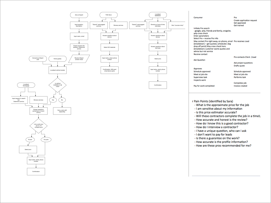
- Studied existing product for pain points, and customer journey of both consumers and pros
- Understand how Redbeacon was perceived and what to bring to Pro Referral
Personas
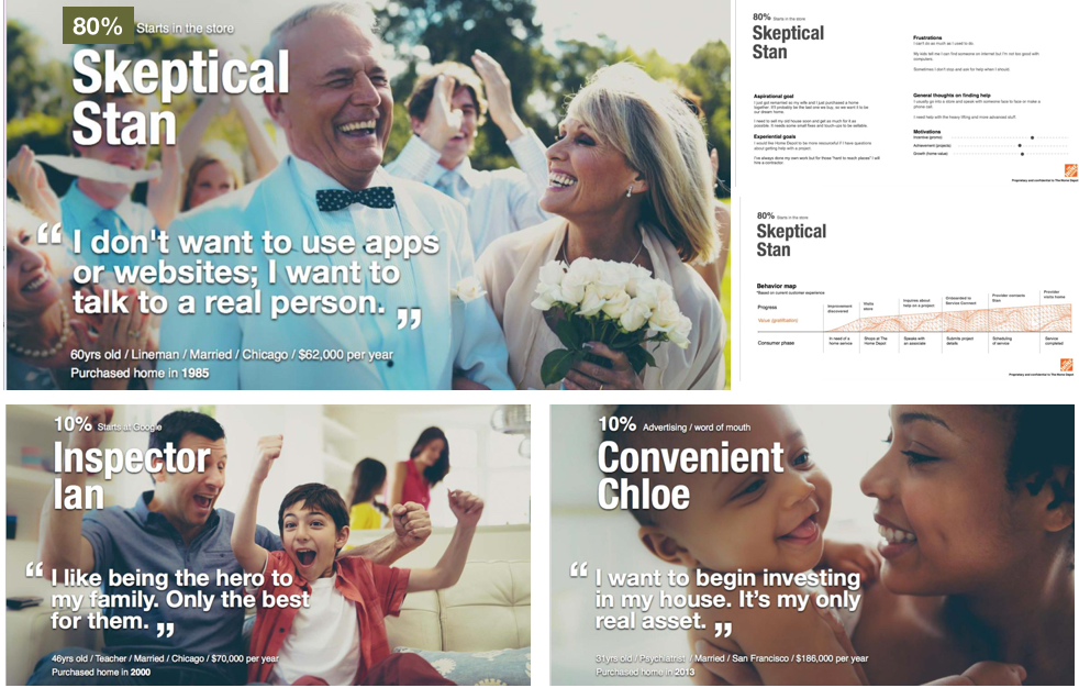
- Identified 3 consumer personas through past research
- We’ve determined that 80% of users use a separate entry point through The Home Depot. As that is out of scope for this project, the other 20% is the focus.
Lo-Fi
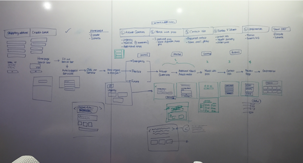
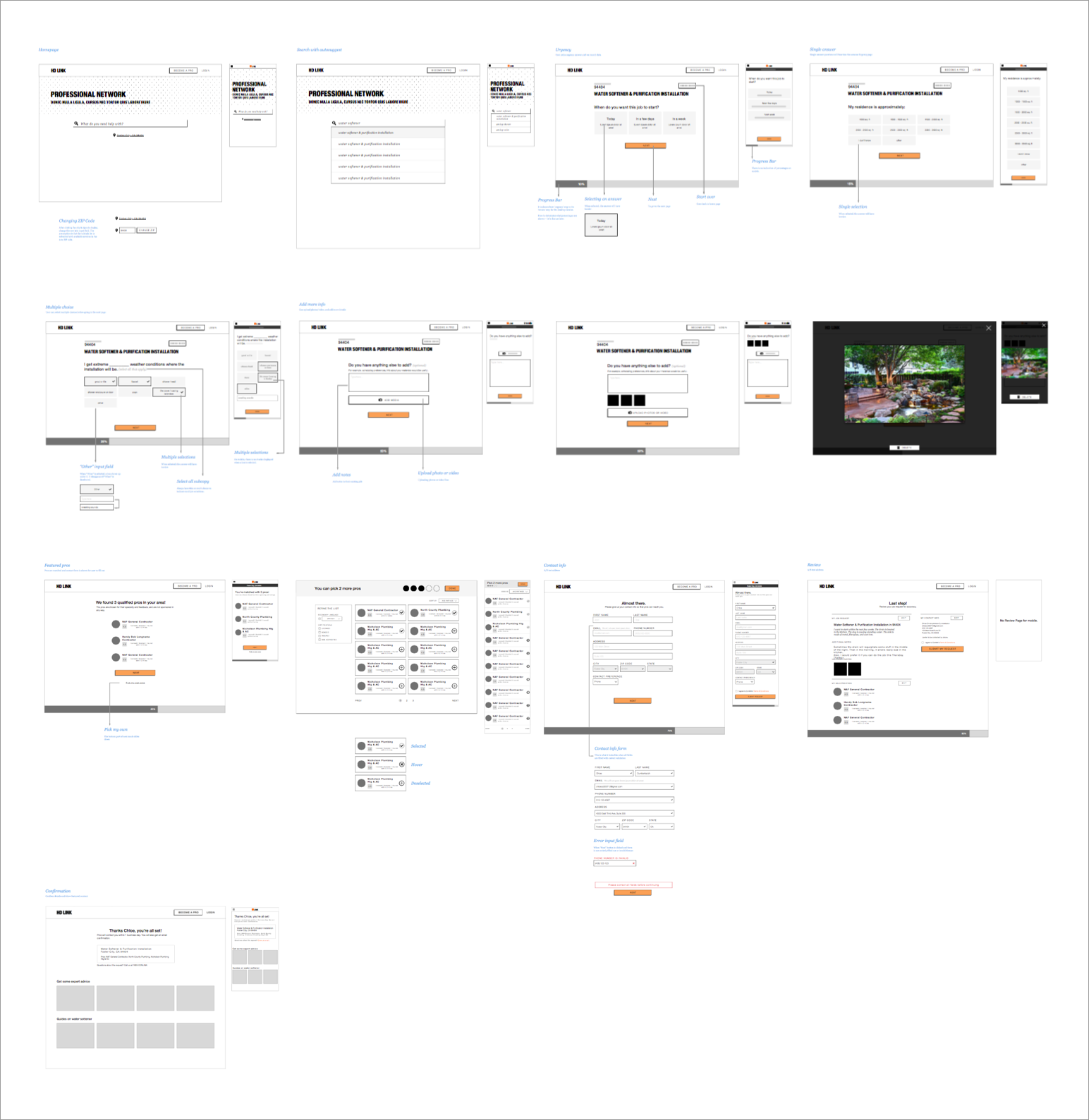
This phase concentrated on ideating in low-fidelity. Another designer and I determined the information architecture, including what to ask of the user, and the logic of the flow.
We divided the flow by task and worked on lo-fi versions on desktop and mobile.
The main tasks were:
- Entering the job request
- Answer basic questions about the job
- Match with pros
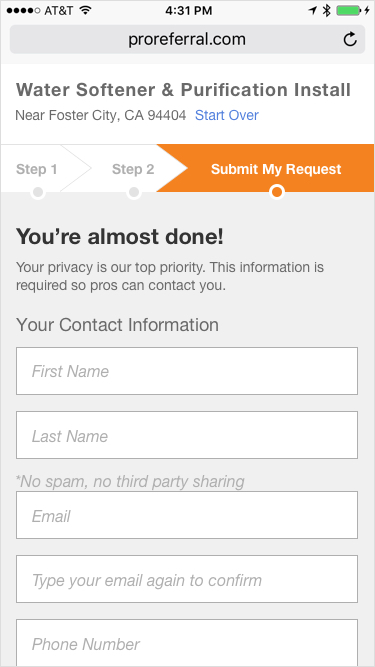
- Enter contact information
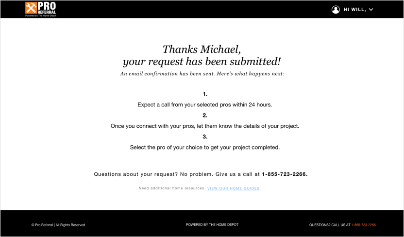
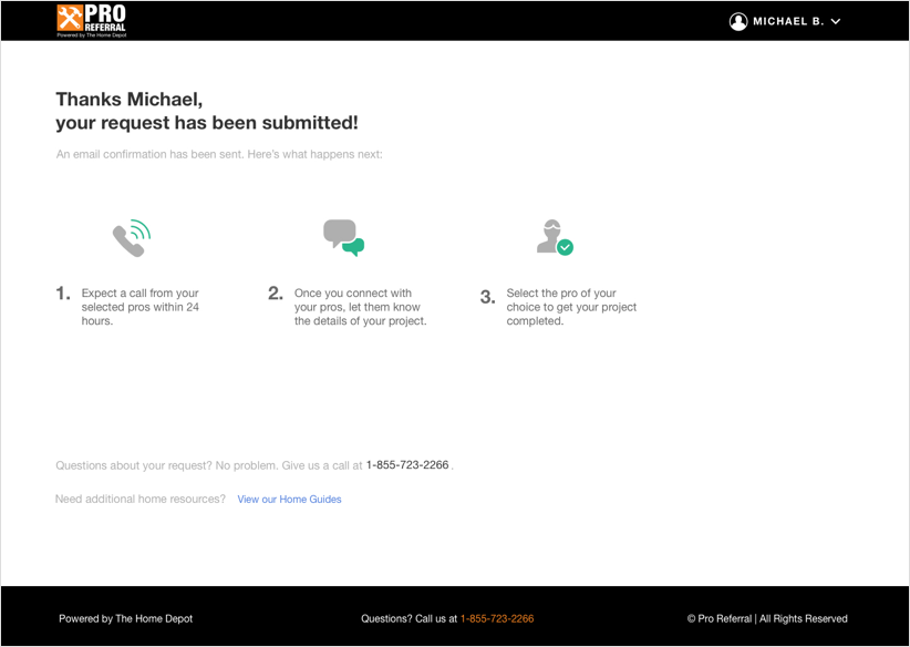
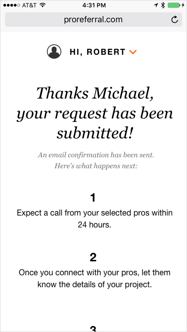
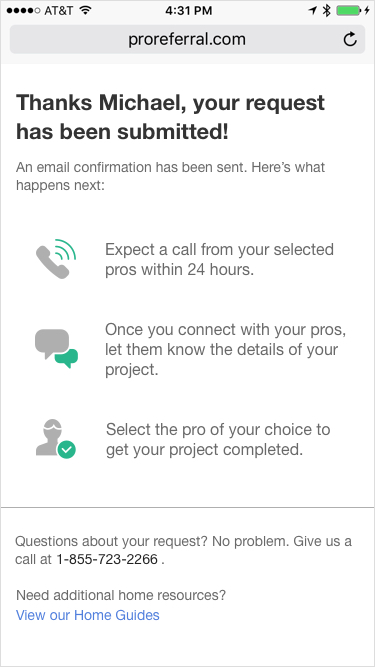
- Confirmation
Mid-Fi
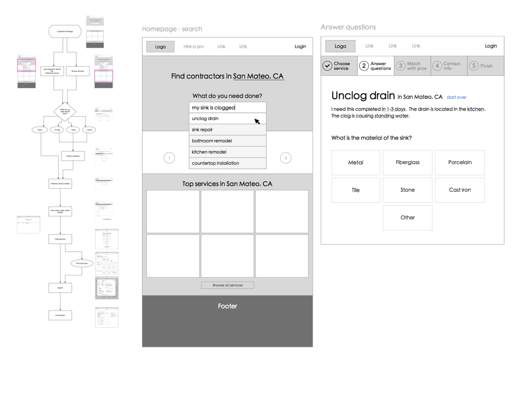
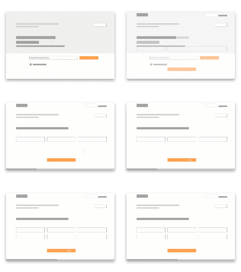
The other designer and I converged the designs using a mid-fi UI kit, and ironed out interactions between pages.
With a more cohesive flow and established main functionality, we met with Product and Engineering to discuss implementation.
Pivot
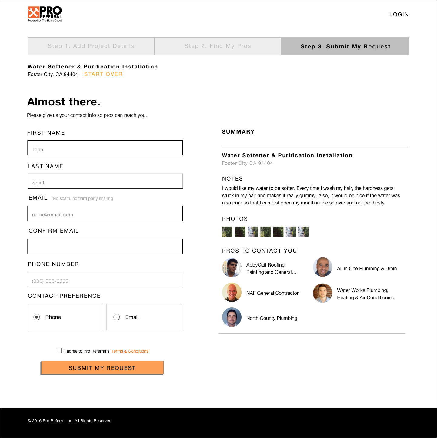
Due to changes in technical direction, more time constraints were added to implementation. As a result, I looked into design changes that can be made without sacrificing usability. Also, some adjustments were made to better reflect business goals.
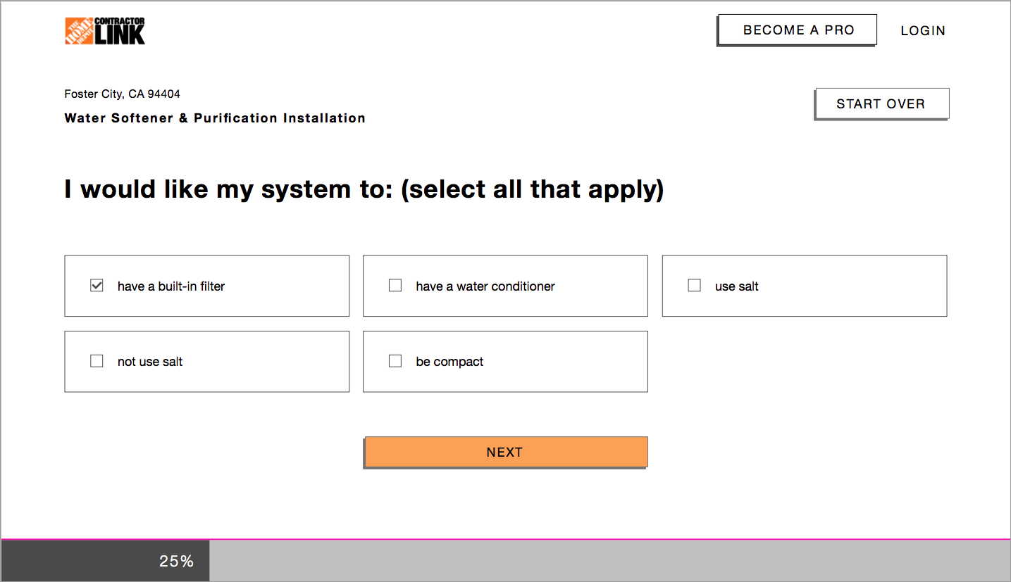
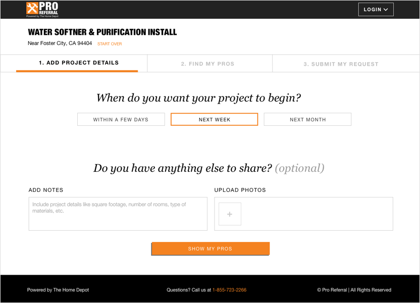
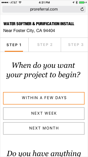
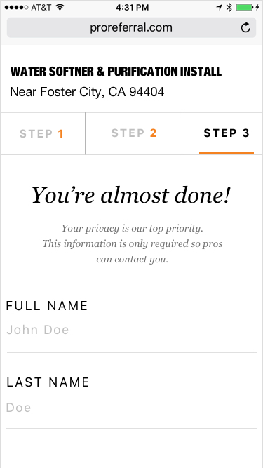
Progress Bar + Madlibs
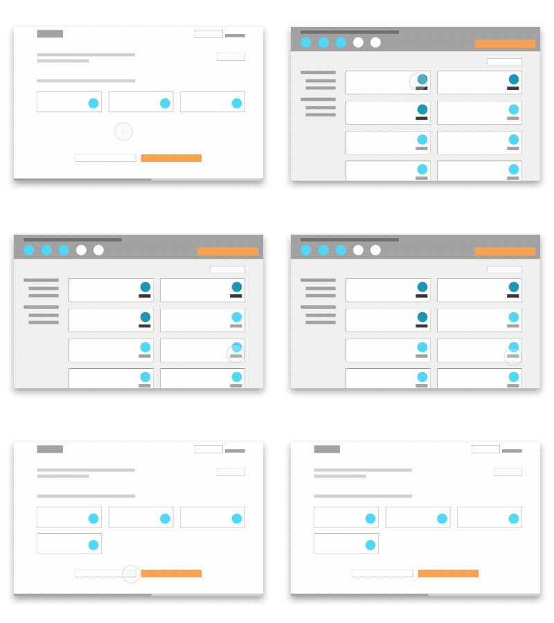
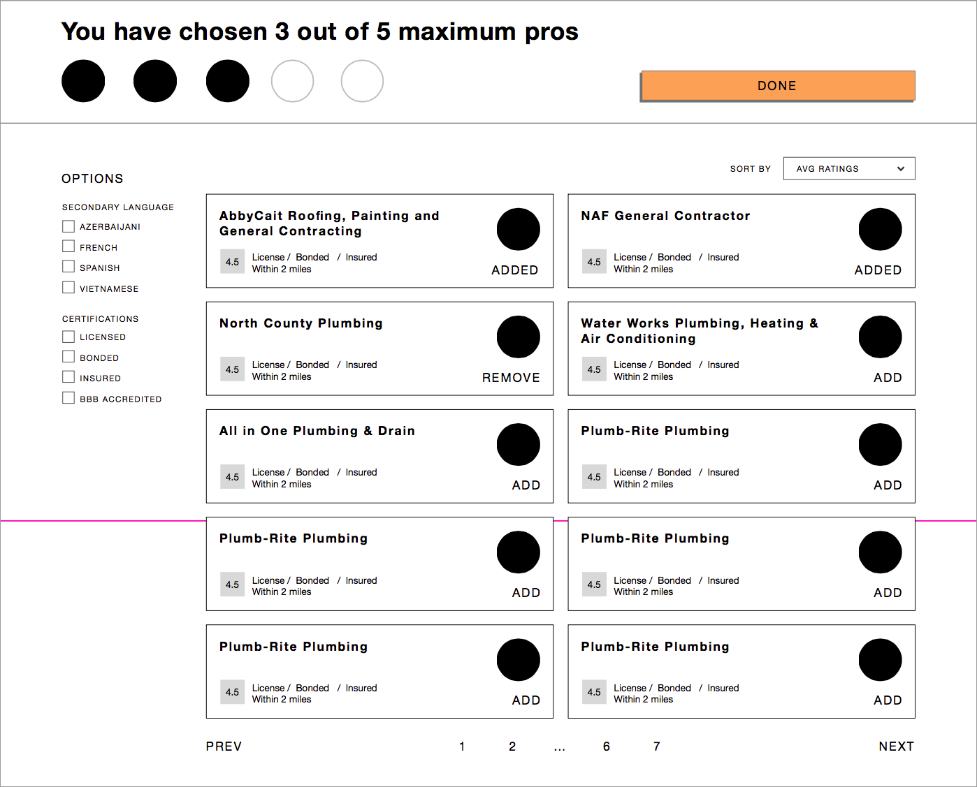
Search Filter + Progressive Disclosure
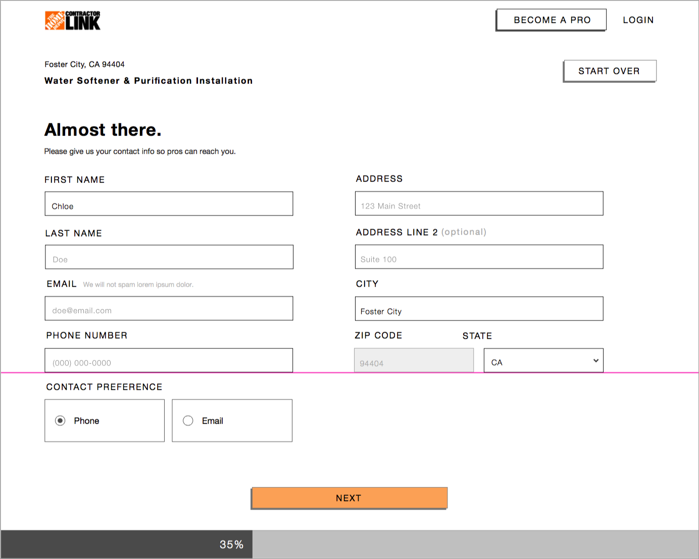
Contact Information
Hi-Fi
At this stage, design is finalized, and I applied the hi-fi UI created by the visual designer. Due to timing, user testing was done right after the MVP launch.
Phase 2: Post-MVP
Goals
- Tackle pain points discovered through user testing
- Support new features introduced by new business requirements, such as account management
Challenges
- Work with remote visual designer to incorporate visual explorations, as this project was the basis of a new design style guide
- Address user testing results by changing layouts and UI elements, instead of relying on new visual style changes
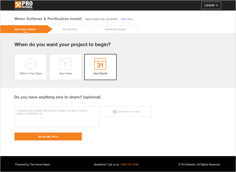
Desktop
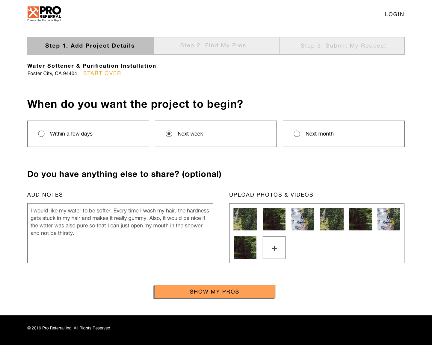
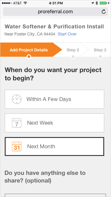
Step 1 – Add project details
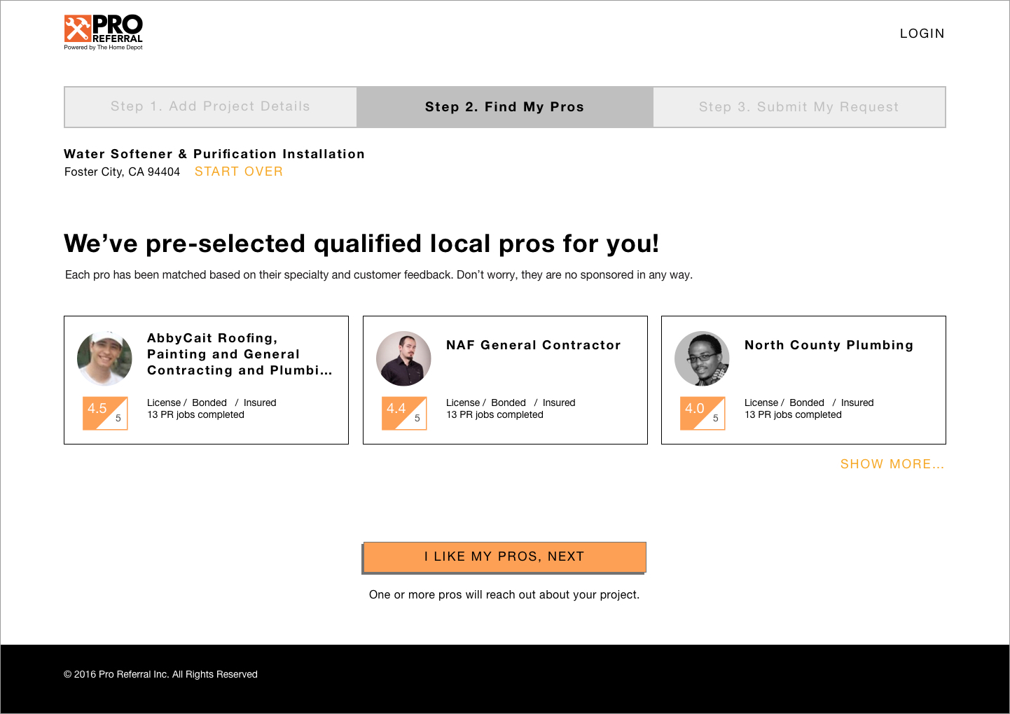
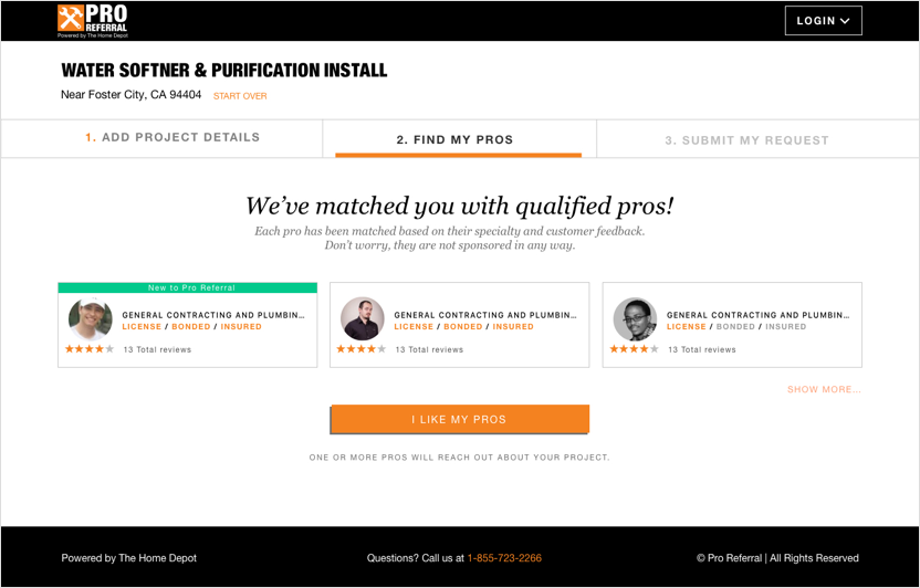
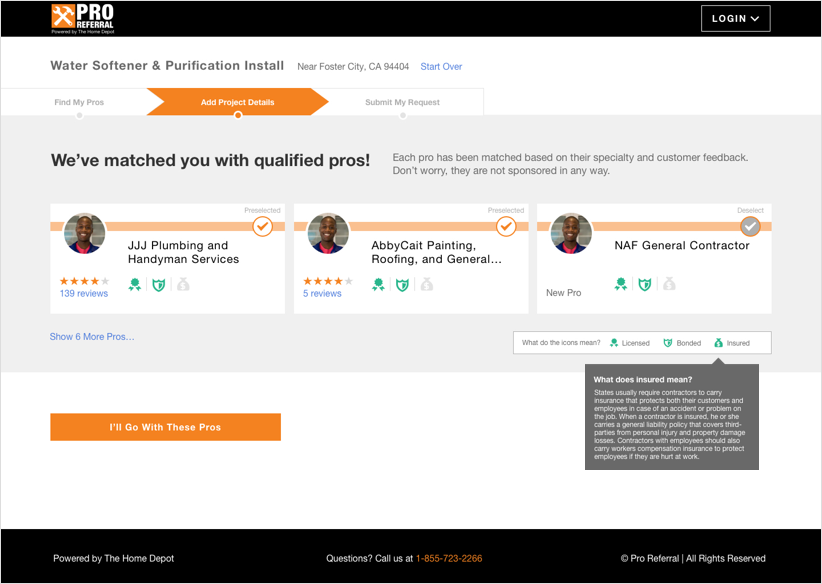
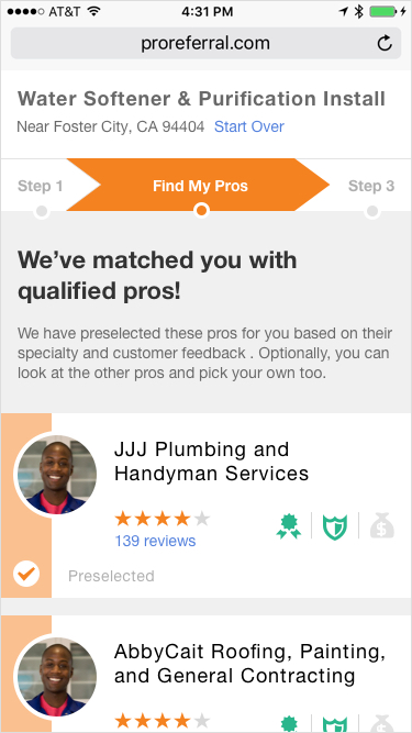
Step 2 – Find my pros
Pain points
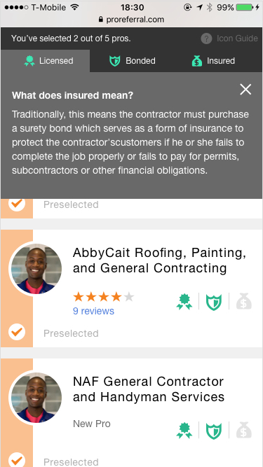
- Confusion on font colors of “licensed / bonded / insured”
- “Show more” option not visible
- Users attempted to select pros
Solution
- Added icons, tooltip and a legend to explain pro credentials
- Added labels and made copy changes to make pro selection process more obvious (addresses pain point in next step)
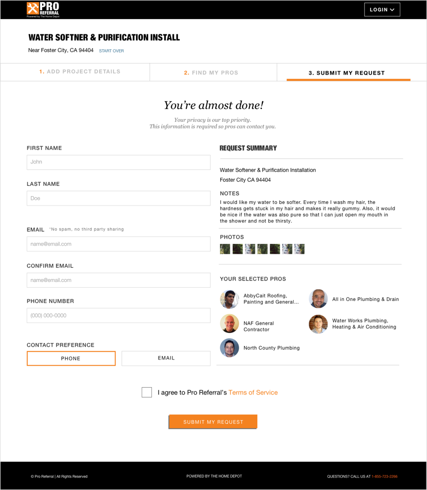
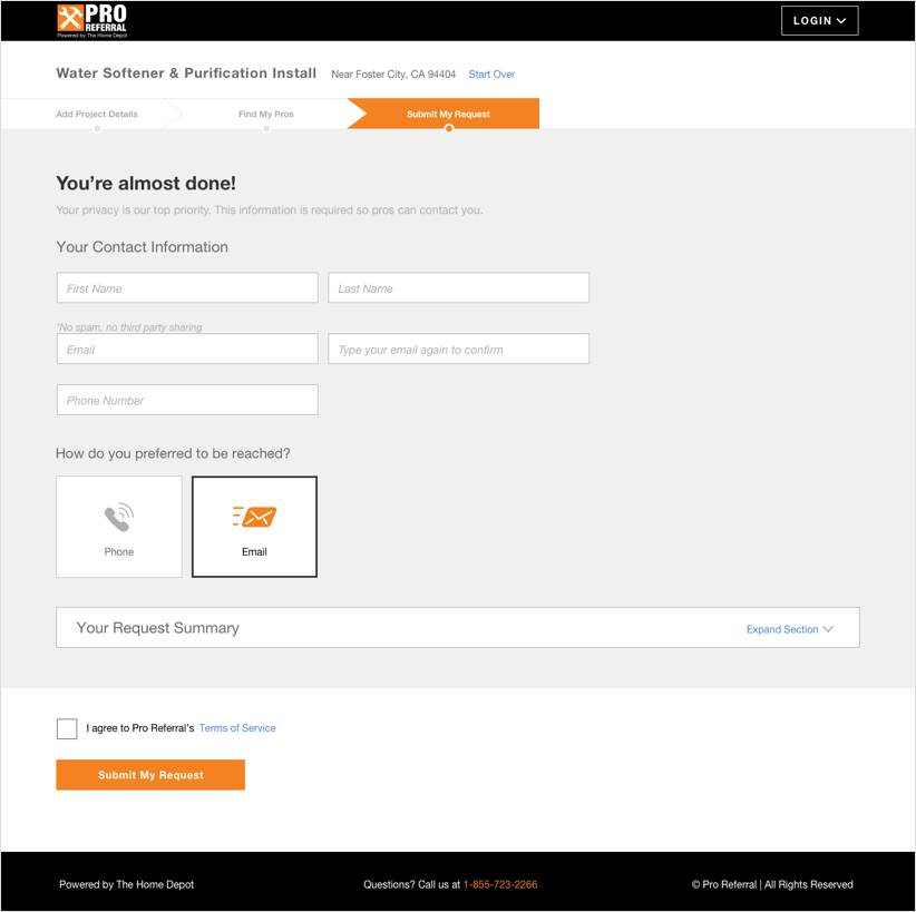
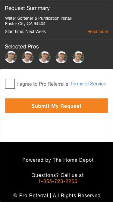
Step 3 – Submit my request
Pain point
- Users didn’t understand how pros were selected.
Solution
- Made previous step more obvious before reaching this page
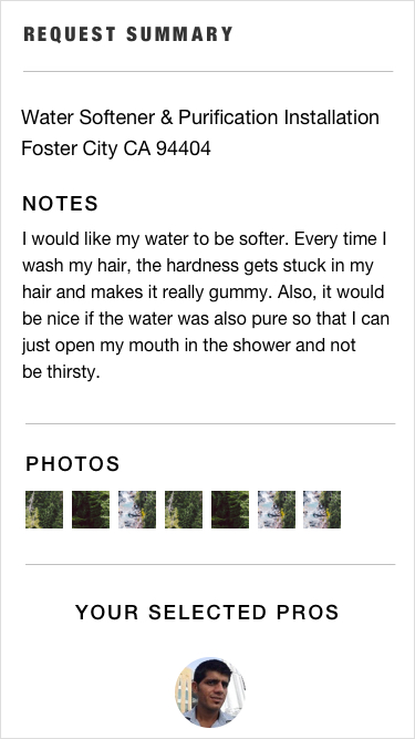
- Hid job request summary to emphasize main action on this step

